
Rite-Aid

Project Type
Feature Addition, Optimization
Industry
E-commerce
Tools
Figma
Role
Lead Designer
Project Overview
Rite-Aid Pharmacy for ios set out to be a companion app here to help you to manage all your prescriptions, Shop for your whole health needs, and have it all delivered to you all at a push of a button.

Problem
As the global pandemic forced millions indoors, Rite Aid faced an urgent challenge: customers could no longer safely or easily shop in-store. Competitors had already introduced same-day delivery services, putting Rite Aid at risk of losing customers. Recognizing this immediate threat, Rite Aid approached us with a clear mission—to swiftly implement same-day mobile shopping and delivery, transforming their app into an essential lifeline for customers needing groceries, medications, and household essentials from the safety of their homes.
Research
The Rite- Aid team initially planned to integrate the web shopping experience into their app using an in app browser, with the goal of launching quickly. Their approach was to bring in certain parts of the shopping experience natively and other parts like search and checkout through launching a web browser. When I tested this approach through a staged white label app they were working on , it was clear that this was not the best experience. When I tested this approach through a staged white label app they were working on , it was clear that this was not the best experience. While I understood their want to move fast to avoid losing revenue. I also knew that a poorly executed experience would guarantee those losses. I made my case and they agreed.


Solutions
Being that this project had a short turn around I knew I wasnt going to be able to do everything and I knew we were going have to build light first and then tack a few things on as fast follow and or second iterations, but i didn’t allow that to hinder designing things right .. my plan was to design the ideal experience and then break it into phases as we figure out whats possible with in our timeline. Although I wanted to turn this mobile experience into a shopping focused app which would mean having the homepage be the launch to the shopping experience .
Home, Search Results, Category Pages
Most of this project was focused on transforming the web experience into a native mobile experience while making optimizations to ensure interactions felt intuitive on iOS and Android.
1) Search by Category – Making it easier for users to browse products with categorized filters directly on category pages.
2) Search Results Page (SRP) – Users can now search and quickly find products without unnecessary steps.
3) Quick Add to Cart – Added direct “Add to Cart” buttons on SRP, so users can add items without having to go to the Product Detail Page (PDP).
These changes made the experience faster, more seamless, and native to mobile interactions—allowing users to shop with fewer taps and less friction.


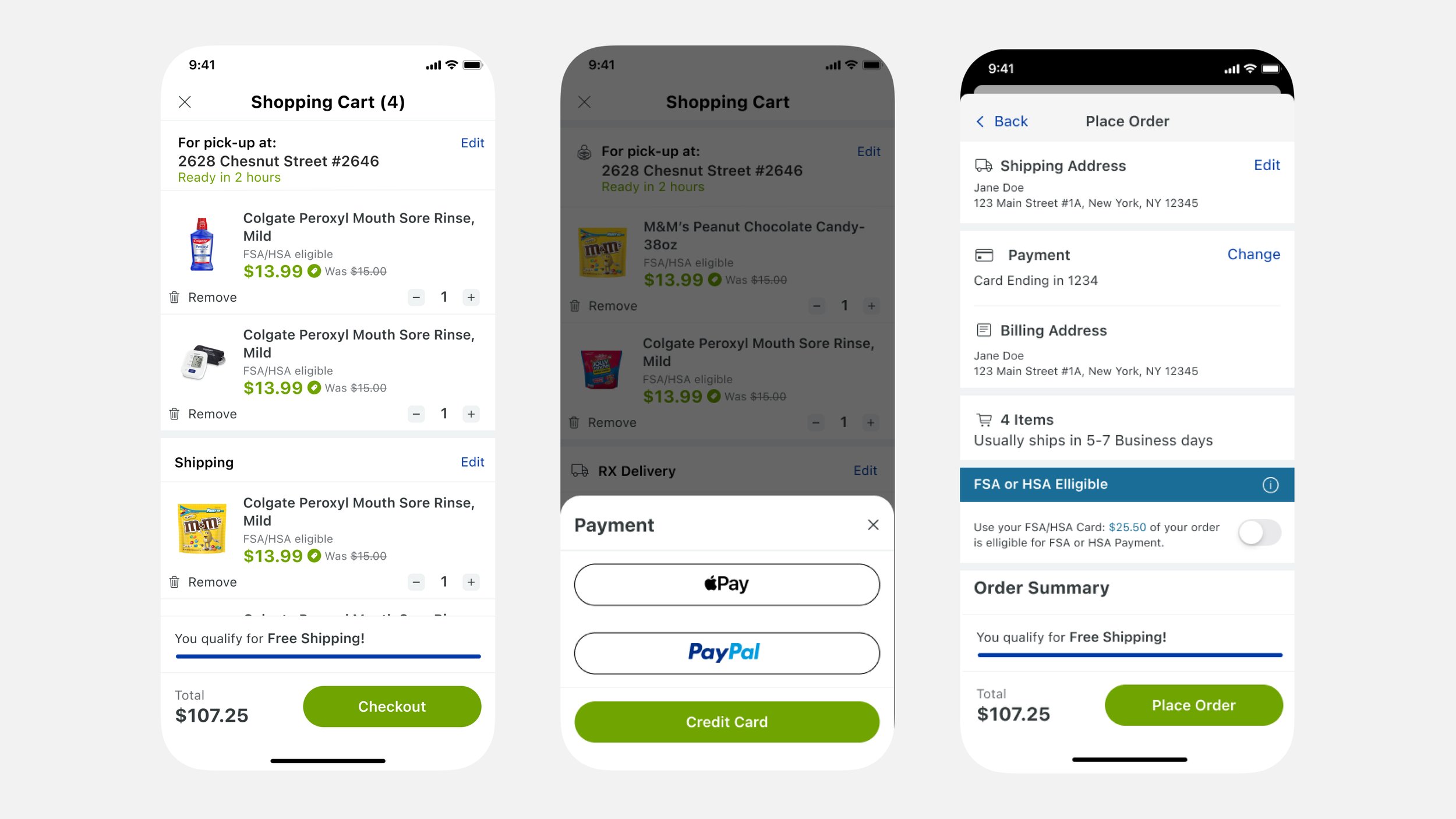
Store Selector
With the option to have your items delivered or ready for quick pickup. I introduced the ability to change stores. This gives users flexibility in how and where they shop. If an item isn’t available at their closest store but is stocked at another nearby location they can change to that store.

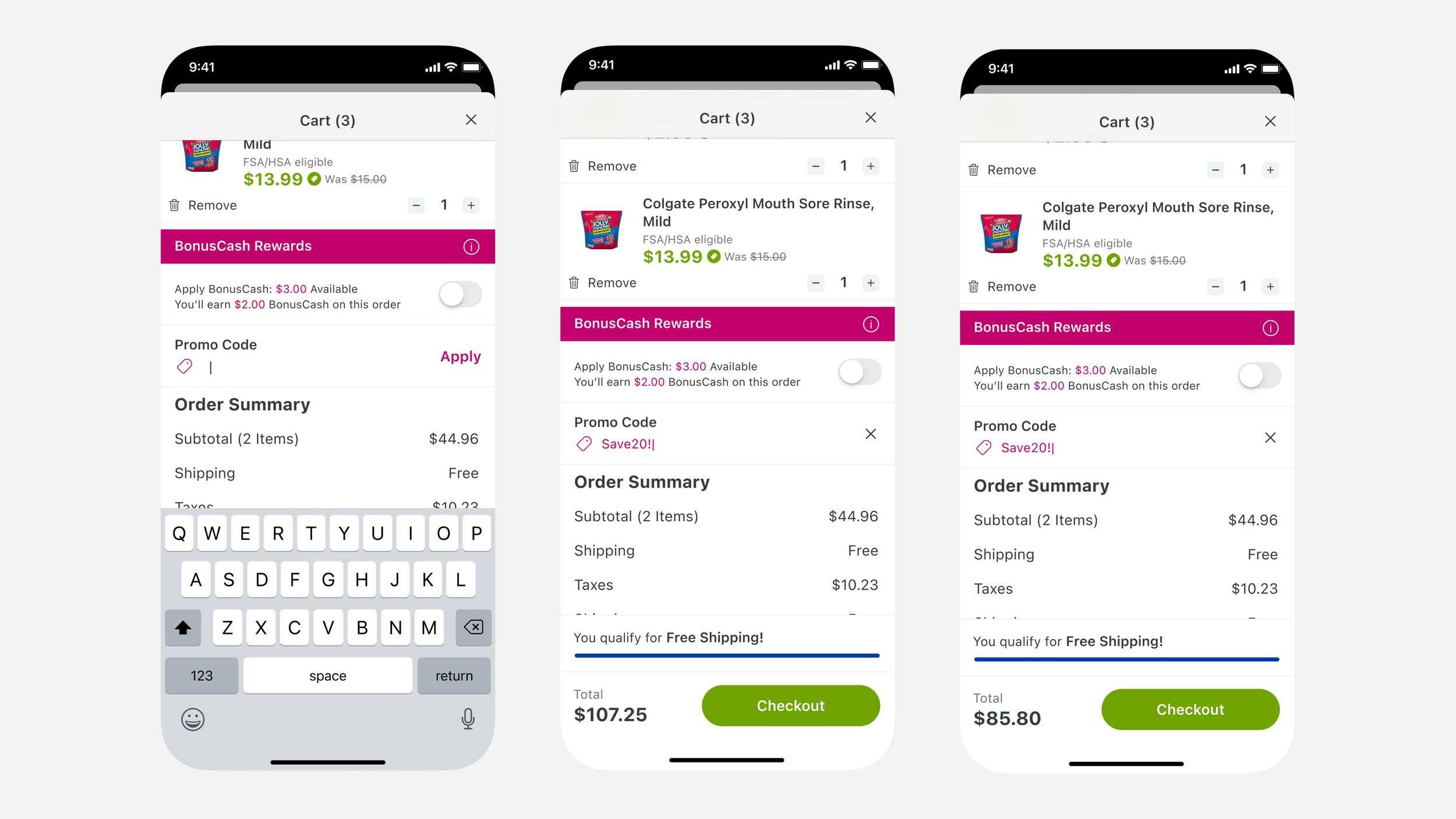
Mixed Cart
We needed a design that could handle split orders seamlessly, as RX items were a special case for delivery and required a different shipping process. In addition to RX users could also have items for Pickup, Standard Delivery, and same day delivery. While it was unlikely that all fulfillment methods would ever appear in the same cart all at once, for me future proofing the system meant designing for the most complex scenario to ensure it would hold up under any condition.
The solution
1) Group items into fulfillment buckets.
2) Allow each section to have its own shipping instructions that users could review and edit fulfillment details before checking out.

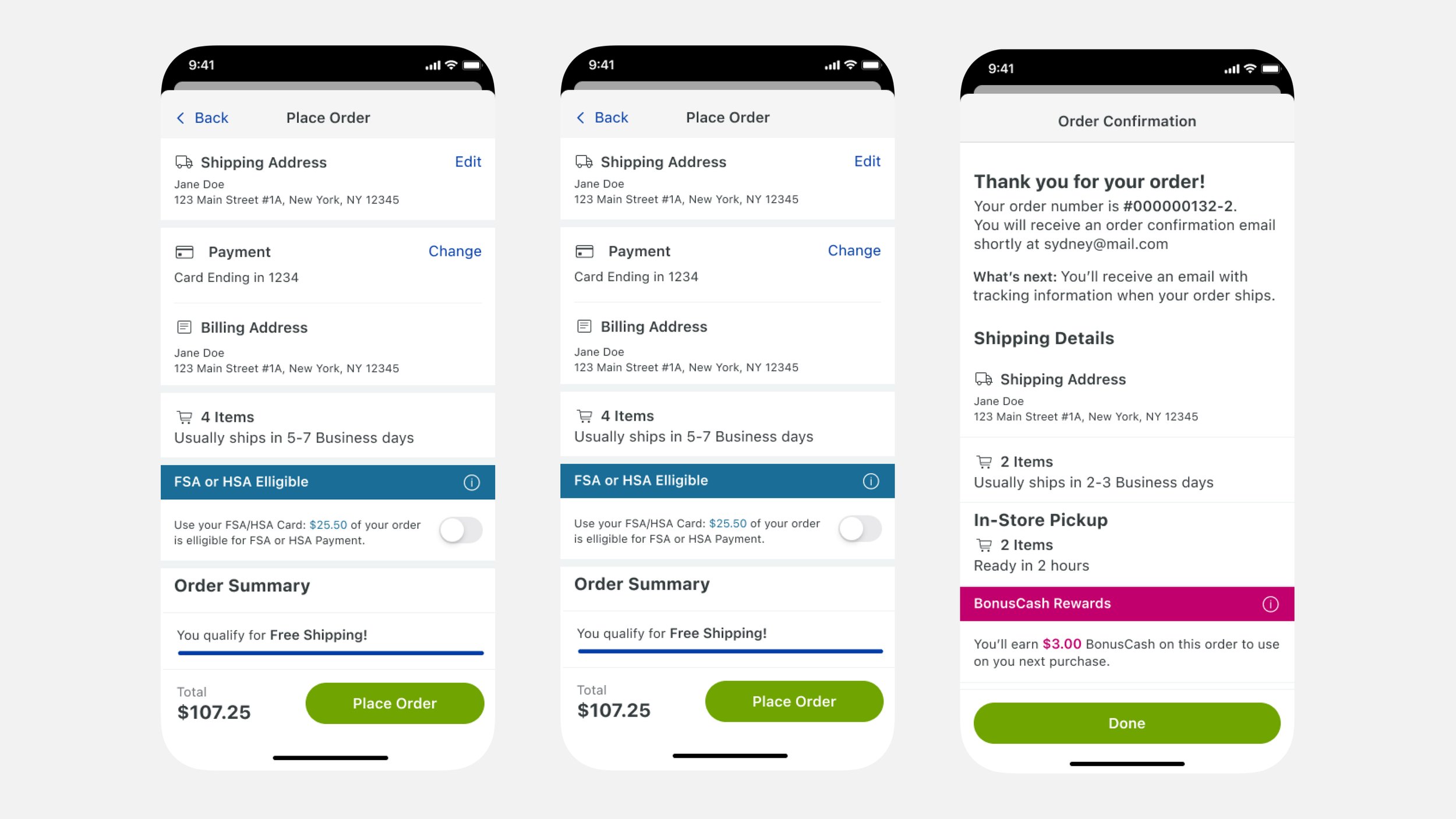
Checkout
I then redesigned and streamlined the checkout process, bringing it step by step in like with common checkout flows used across leading e-commerce platforms
1) Simplified Steps
2) Consistent UI Pattern’s
By refining the flow to match established checkout best practices, I improved usability and made the experience more predictable for users,
reducing cart abandonment and improving conversion rates.

Things I learned
This project was important to me because it reminded me that sometimes you don’t have the option to do all the “right” things. There are moments when you have to design within the system you’re given and focus on creating the best possible solution within those constraints. When designing a product from 0 to 1, the world is your oyster—you can shape the experience however you see fit. But when working within an existing ecosystem, you have to balance vision with reality. While working on this project, I put together a presentation outlining what I believed would create the best possible shopping experience. I advocated for making the shopping flow the primary focus of the experience and suggested optimizations that would bring this closer to a best-in-class E-commerce experience. But for every proposal, I was met with reason after reason why it wasn’t feasible—whether due to technical limitations, legacy systems, business priorities, or compliance requirements. This was a critical learning moment: great design isn’t just about creating the ideal experience—it’s about finding the best experience possible within real-world constraints.
Whats Next
To ensure the product remained cohesive, the engagement was wrapped up with documentation and a design system. This included: A library of reusable UI components , prototypes, Interaction patterns and best practices, and
Documentation for developers. This not only elevated the current experience but also set the foundation for future improvements, giving the team the tools to continue evolving their platform with a unified design approach.


