Toast

Project Type
End-to End Design and Research, ios-native
Industry
Local Search & Discovery
Tools
Sketch, Research Focus Groups
Role
Lead/Founding designer
Project Overview
Toast set out to redefine local discovery by replacing outdated star ratings and written reviews with a recommendation based system that prioritizes word of mouth suggestions, moods, and occasions over arbitrary rankings.

The Problem
Local search is broken. Small businesses struggle to compete on popular review-based discovery platforms where visibility is often pay to play advertising models and unchecked power of reviewers. Many small businesses get buried under results by competitors who can outspend them on advertisements, or held hostage by bad reviews and sometime influencer exploitation.
User Findings
Our research tells us that real time , contextual recommendations from trusted sources such as friends, locals, or community driven input have a far greater impact in influencing decisions than traditional review based discovery platforms that operate under the assumption that star ratings and user written reviews are still the primary drivers of how people decide where to eat, drink, or visit.


Hypothesis
When choosing were to go, people prioritize word of mouth recommendations first, mood and occasion second, and reviews and star ratings last
User Goals
The platform would has 3 distinct user groups: Business owners, Influencers, and Everyday Consumers. One could argue that the Venn diagram between Influencers and Consumers would end up as a circle — I would respectfully disagree. While there may be some overlap in how they use the platform their motivations and end goals differ significantly.

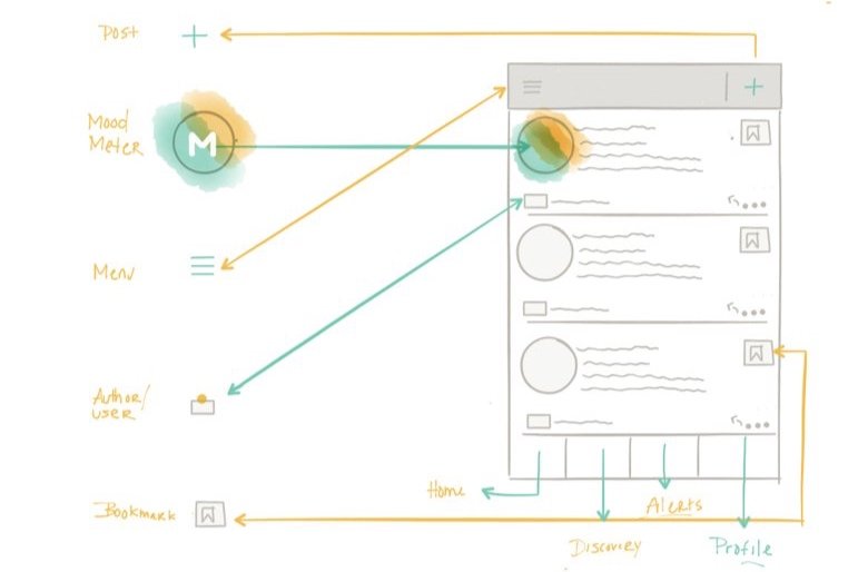
Features
Before defining the full set of features, I started by mapping out the end to end journey for each user type. This helped me understand the core functionality each user would need to complete their journey and where friction points might occur. Once the journey mapping was finished, I compiled a basic list of essential features needed for each user to successfully navigate the platform.
To refine the feature list. I conducted interviews with power users from Q&A platforms like Quora and Reddit to understand how they used the platforms, what features they found valuable, and what their pain points were. I used these insights to shape the feature choices as well as the overall experience


Racing toward MVP
We were living in Manila, running on a tight timeline, and running out of funding. That meant development had to begin work while design was still being finalized. To create some space for design time, I set up a working session with our dev team to align on the core features for the MVP, determine what we could realistically build by the deadline, and talk though any technical constraints or concerns they might have had. I lead a whiteboarding session to iron out potential issues, and I shared some basic wireframes to add some light direction.
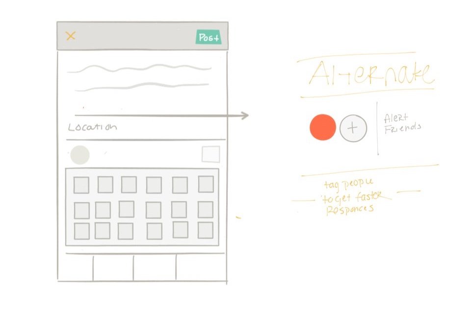
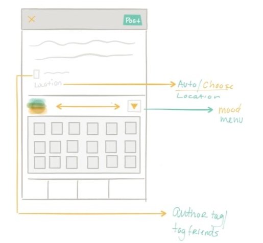
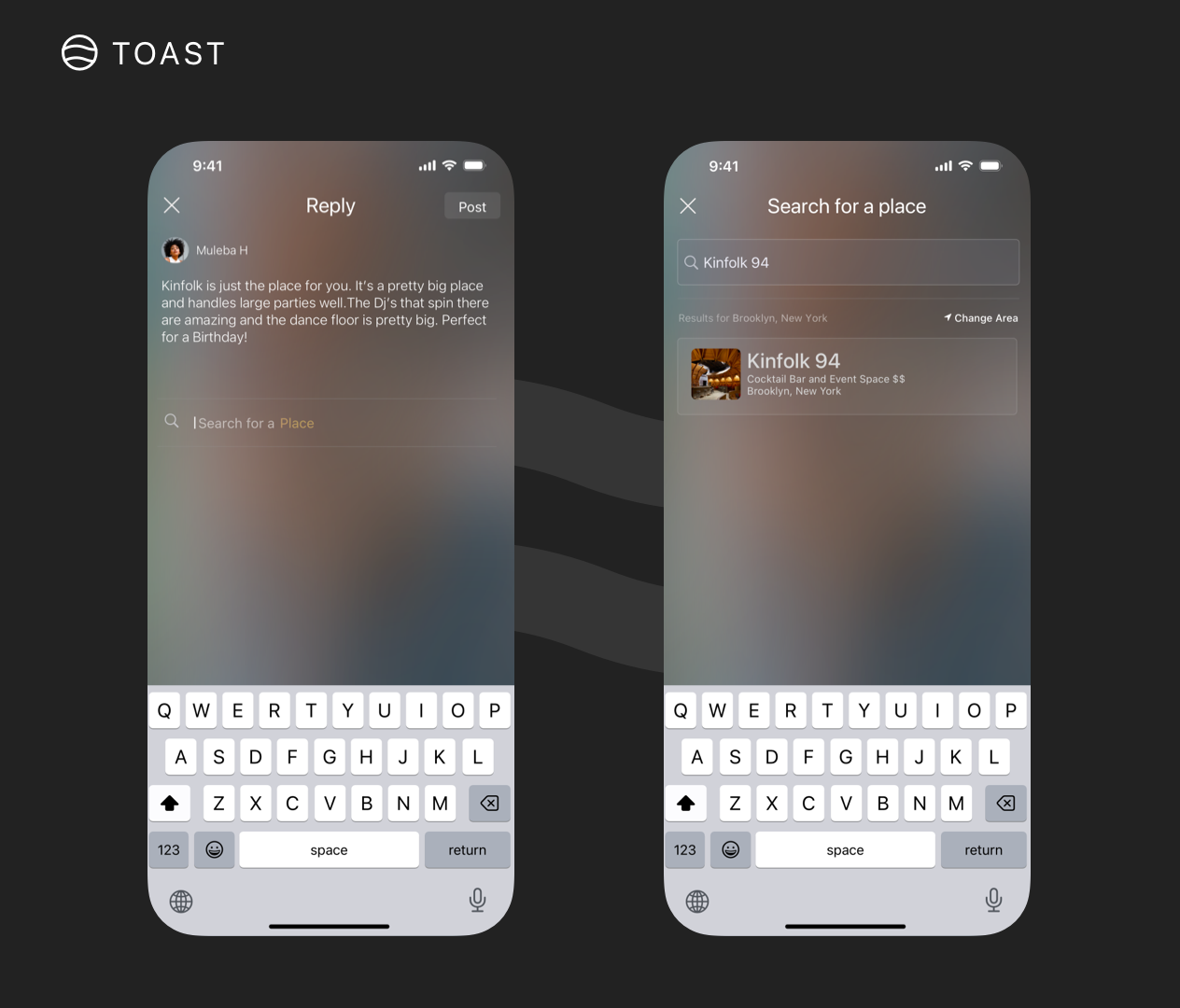
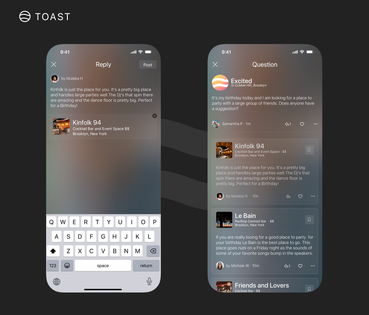
My biggest frustration might have been finding out we were going to have to compromise on users input flexibility. Due to the time constraints, instead of users having the ability to freely ask questions, they would be restricted to dropdowns and selectors. Users would first choose a mood and occasion - like celebration, large group, date night, then they would select what they were trying to do like eat, drink , or party Based on these choices we would formulate a question for them and post it to the feed.


Features
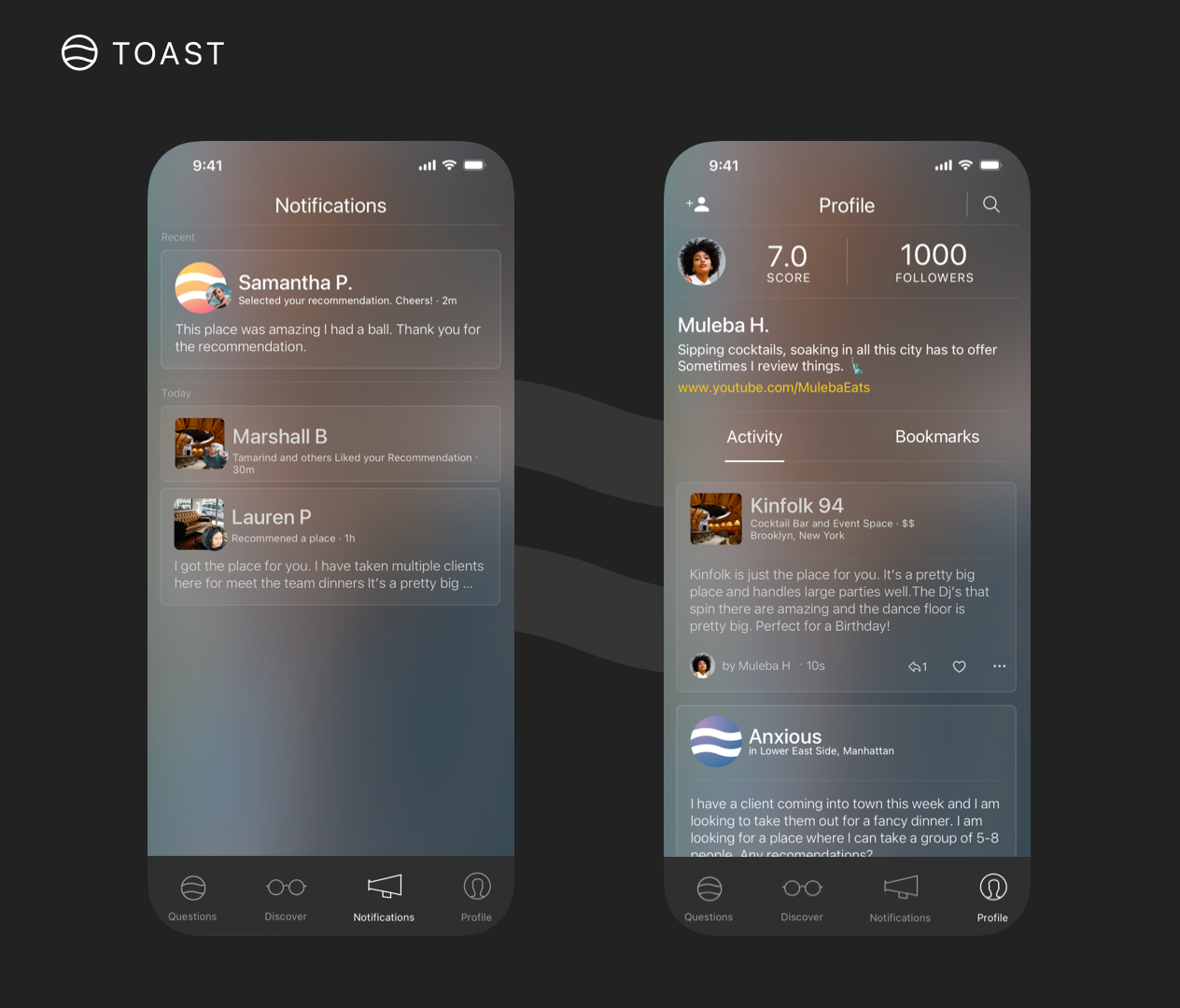
I had to manage Dev building the rough version for beta which (would only be built off my verbal feedback and impromptu sit down white board sessions.) testing while finalizing the designs basically flying the plane and building it at the same time. Not the most ideal but a common occurrence in startup world. Having all the insights from the research, and a phased feature plan made less stressful to design for the full launch after beta. I wireframe out all of the core functionality,fleshed out all the in between screens for pop ups and interstitials, I combed though the userflows for


Branding & Story
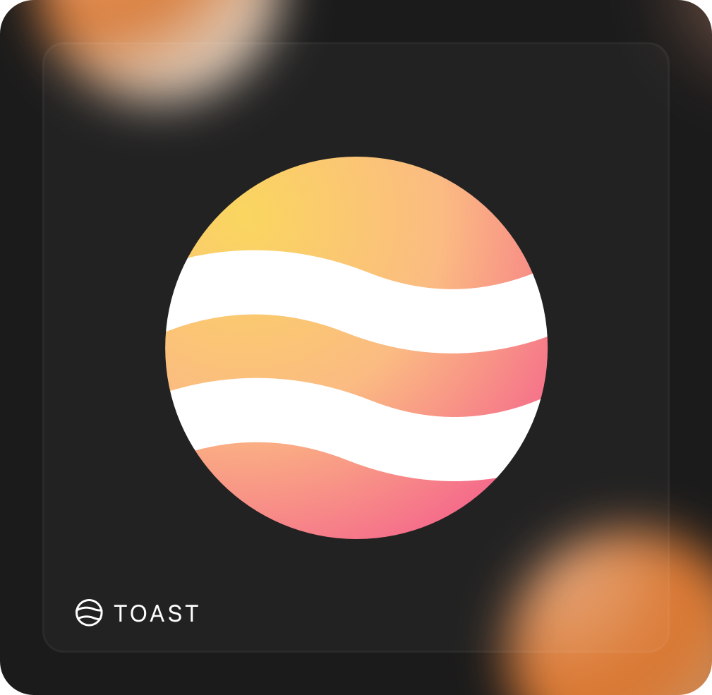
I wanted to create a logo that would fit the brand story. After some sketches and a few broken pencil tips, I put together elements that attempted to perfectly explain what Toast was. The two keywords that stood out in the brand story were "moods" and "feelings." I took those two words and stretched them as far as I could, with inspiration from the ever-so-popular mood ring. Element one adapted the idea of moods being represented by gradients.
The second element emerged from the synonymous term "VIBE." Inspired by this, I drafted the concept of transmitting vibration waves as a visual expression of energetic currents. This discovery helped in the creation of the new brand symbol—one that goes beyond its role as just a representation of the brand and becomes a functional component deeply embedded within the platform itself.


Whats Next?
While we weren’t able to continue scaling Toast beyond its first year, as a person that loves every bit of the process of finding solutions to problems, what I loved most was that the insights we uncovered validated our theory—that the world was moving towards more personalized experiences.
Using theory as a fulcrum to balance our hypothesis, we believed that a recommendation given to you by someone with context such as your mood or your occasion—would lead more people to discovering businesses over ratings and reviews. Pairing that idea with localization and allowing people to share context driven recommendations from locals would help to uncover more small and local business.
Given more resources, I would have focused on keeping people engaged, we had a model that was light weight and could launch in any city at anytime given the right tools, but I really wanted to work on a business model that business model that allowed influencer to get kickbacks for being ground zero for foot traffic to these business. On the flip side given local business access to data about foot traffic, market research tools, and assistance in creating a stronger connection to business and its patrons all together. Today, we see platforms integrating more social-driven recommendations, further proving that the vision behind Toast was ahead of its time.
What I learned
Great Design isn’t just about UI
This project marked my transition into product design after working in branding design for years( Which is where I gained my love for research). Most people don’t realize how much research goes into branding— they often just write it off as pure visual. And while I agree it definitely leans more visual, there are a lot of parallels to UX. One of those parallels—the thing that keeps me up at night—is my constant need to understand what makes people do the things that they do. It was through this project that I found my calling for UX, a profession that merges my love for visual design, my need to understand people, and my drive to solve problems. Its also where my firm stance on great design got even firmer. Great design isn’t just about UI—it’s about understanding behavior, challenging assumptions, and building products that people truly connect with.


The people who you are building for have all the answers you need.
At every turn, when I got stuck, I did not hesitate to turn to previous user research, studies, or set up a focus group. Our main investor gave me access to a user testing account and a team he worked with to do focus groups and survey’s and I used it as much as I could. When I needed a better understanding of Q&A platforms I went straight to the people that used them most. What I learned is that to get the answers you seek, you have to be extremely curious, and unafraid to be wrong in your assumptions. Its this way of thinking led me to understand that the best solutions to the problems we are looking to solve often come from the mouths of those encountering them firsthand.
